Write out an error message in text
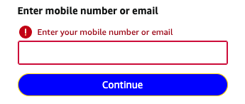
Always write out the error message in text. Don’t just add a border around the field or add an icon, but always write out the message in clear, plain language.
You can certainly use color and icons as decoration, and they will be helpful to many users, but they should not be the only indication of an error.
Make the message clear for all users
By adding text you make sure all visitors understand the error message. Color blind or visually impaired users may miss borders. Your choice of color may not be understood as a warning in every culture, and not all people understand what icons mean.
Connecting the error message text to an input field works the same as connecting description texts: Connect the description to the form field.
Resources
WCAG Success Criteria for text in error messages
Describing form errors in text is required to meet the WCAG success criteria:
- 1.3.1 Info and Relationships (Level A).
- 1.4.1 Use of Color (Level A).
- 3.3.1 Error Identification (Level A).
Other resources
- NL Design System Guidelines for web forms (Dutch content).