 WP Accessibility Knowledge Base
Place descriptions between label and form field
Note: this is best practice and not a WCAG requirement.
Users read from the top down in a form. Place descriptions in a consistent location, preferably between the label and the text form field. Then information appears after the label at a logical point in the reading order.
This also reduces the chance of the information overlapping with browser and browser toolbar popups. For more information and user research, read the article Avoid Messages Under Fields by Adrian Roselli.
For checkboxes and radio button groups, place the description between the legend and form fields. This is explained on the page about Descriptions in fieldsets.
Also check the description decision tree about how to handle more complex descriptions.
Examples
Place descriptions in a consistent location, preferably between the label and the form field.
<label for="new-password">New password</label>
<p id="description-new-password">
    Choose a password of at least 8 characters long.
</p>
<input
        id="new-password"
        type="password"
        name="new-password"
        aria-describedby="description-new-password"
        autocomplete="new-password"
/>
Place all descriptions, including error messages, in a consistent location, preferably between the label and the form field.
<label for="name">New password</label>
<div id="description-new-password">
    Choose a password of at least 8 characters long.
</div>
<div id="error-password">
    Your chosen password is too short.
</div>
<input
        id="new-password"
        type="password"
        name="new-password"
        aria-describedby="description-new-password error-password"
        autocomplete="new-password"
/>
Avoid placing the description below the form field.
<!-- do not copy, this is not user-friendly -->
<label for="new-password">New password</label>
<input
        id="new-password"
        type="password"
        name="new-password"
        aria-describedby="description-new-password"
        autocomplete="new-password"
/>
<p id="description-new-password">
    Choose a password of at least 8 characters long.
</p>
Do not place a description above the form field and an error message below it. Be consistent in the location of descriptions.
<!-- do not copy, this is not user-friendly -->
<label for="name">New password</label>
<div id="description-new-password">
    Choose a password of at least 8 characters long.
</div>
<input
        id="new-password"
        type="password"
        name="new-password"
        aria-describedby="description-new-password error-password"
        autocomplete="new-password"
/>

<div id="error-password">
    Your chosen password is too short.
</div>
Setting the description location in WordPress Plugins
Gravity Forms
Use the “Form Layout” settings on the Form Settings screen:
- Label Placement: Top aligned
- Description Placement: Above inputs
- Validation Message Placement: Above inputs
- Sub-Label Placement: Above inputs
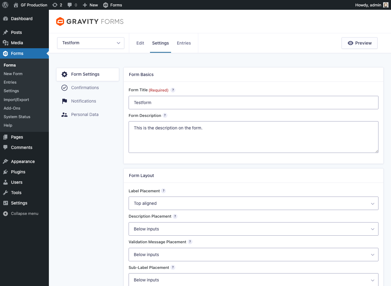
Read more on: Gravity Forms Accessibility Guide for Content Providers.
Other form plugins
We’d like to invite people familiar with other plugins to add instructions for those plugins. Please contact us if you want to help us with additional content.
Resources
- NL Design System Guidelines for web forms (Dutch content).