Using color
This content will be reviewed and restructured. Related issue on GitHub #130 Topic Color Use of color.
Using color to differentiate between elements on a page is fine. However, you should avoid using color as the only visual means to differentiate parts of a page. For example,
- error, success, or note messages
- links in the content
- active, hover or focus states
- display information updates
Use additional styling to indicate types of information including a change of shape or decoration. For example:
- Change symbols in addition to color
- Underline links that are embedded in text
Grouped links in sidebars, footers, or in navigation menus frequently don’t need to be underlined. If it is obvious in context that the text is a link, underlines are not required. However, in many cases underlining can increase the usability of your website.
Examples
Correct
Underline your links, which are placed between text.
Underlined links are easier to see.

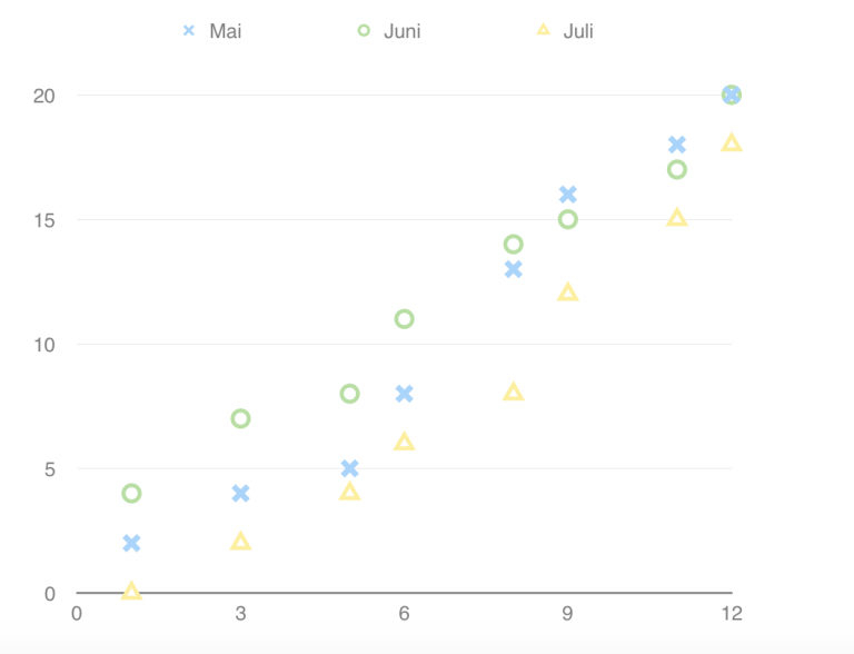
Use symbols and colors in graphics.
Graphic with differently shaped symbols in black in white.
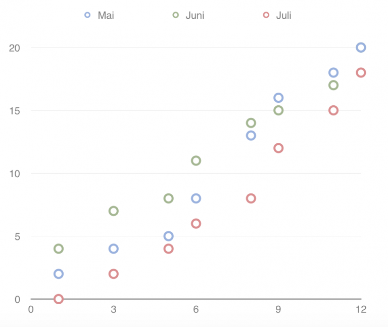
Incorrect
Links not underlined – color blind users may have trouble distinguish links from text.
Can you see the links now?

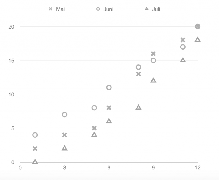
Color used as the only indicator for information or functionality
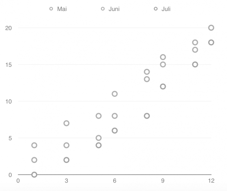
The easiest way to check whether your website is usable for colorblind people is to test it in grayscale. When the color information is extracted, you can more easily see whether your website is still understandable.
Resources
- Adrian Roselli: On link underlines
- WebAxe: Keep the underline