 WP Accessibility Knowledge Base
The use of color
Color is a powerful way to add meaning to elements on a page. However, you need to make sure color is not the only way users can get this additional information.
Users who are colorblind, are visually impaired, or who don’t understand the intention of the color you chose, will otherwise miss the information. A color may not have the same meaning in every culture. Always add additional information when you use color in a meaningful way.
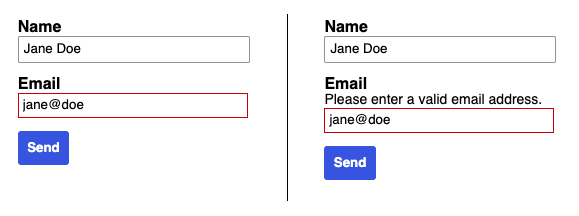
In addition to color, use another way to add information. For example:
- Underline links in the content. More info in Styling links.
- Add an icon and additional text with status messages.
- Always add additional text with form errors. More info in Write out an error message in text.
- Style hover and focus states of links and buttons using more than just color changes. More info in Styling focus and hover states of interactive HTML elements.
Examples
Don’t: Use only color to distinguish the different items in a graph.
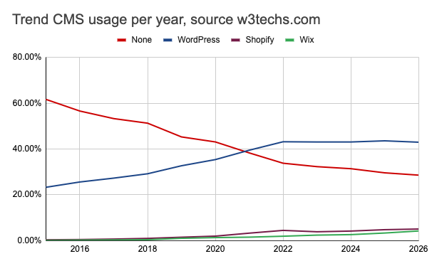
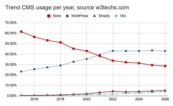
Source data: Historical yearly trends in the usage statistics of content management systems by W3Techs.
Do: In addition to colors, use line shapes and/or symbols, so colorblind users can understand the data too.
Don’t: Use only color to indicate a link in a paragraph of text. Visitors may miss important links.
Forgotten vegetables are those once-common crops that have largely disappeared from modern diets. They were very common before, but now our food choices have changed.
Do: Underline the link a paragraph of text.
Forgotten vegetables are those once-common crops that have largely disappeared from modern diets. They were very common before, but now our food choices have changed.
Check your design in gray scale
To check if your website works for colorblind users, you can view it in grayscale. Without color information, you get a better sense for whether your site is easy to understand.
Some tools to emulate how colorblind visitors view your website:
- Sim Daltonism, an open source color-blindness simulator for macOS and iOS.
- Colorblind Web Page Filter, a color-blindness emulating filter for a web page, by TopTal.
Resources
WCAG Success Criteria for the use of color
- 1.3.3 Sensory Characteristics (level A).
- 1.4.1 Use of Color (level A).
- 1.4.3 Contrast (Minimum) (level AA).
- 1.4.11 Non-text Contrast (level AA).
Related pages in this documentation
- Sufficient color contrast of text and UI controls in the Theme guidelines for the WordPress accessibility-ready program.
- Underlined links in text in the Theme guidelines for the WordPress accessibility-ready program.
- Styling links in Standards and best practice, Design & user experience.
- Styling focus and hover states of interactive HTML elements in Standards and best practice, Design & user experience.
- Write out an error message in text in Standards and best practice, Web forms.