 WP Accessibility Knowledge Base
Color contrast of text against its background
Sufficient contrast between text and its background ensures that content is easier to read. This also applies when someone is visually impaired or when the sun is shining on your smartphone screen.
For example:
- Now you see me, color contrast 7:1.
- Now you don’t, color contrast 2:1.
Good color contrast should be considered for the text color and background colors (or images), but also needs to be considered for dark mode, placeholders, and hover or focus states of text in links and buttons.
The guidelines for WCAG 2.2 Level AA require that the contrast between background and foreground colors for text has a luminosity contrast ratio of:
- 4.5:1 contrast for normal text.
- 3:1 contrast for larger text (24 pixels and up).
- 3:1 contrast for bold text (bold and 19 pixels or larger).
The actual units mentioned in the WCAG guideline 1.4.3 Contrast (Minimum) are in points (pt), and 24 pixels and 19 pixels are approximate conversions. The documentation about Understanding SC 1.4.3 Contrast (Minimum), by the W3C, explains this calculation in detail.
Tip: Logos and logotypes are exceptions to accessibility guidelines, including color contrast rules. If you’re designing a new logo, however, it might be a good idea to consider them, anyway.
Color contrast should be high enough for good readability but should not be too bright for people with sensitive eyes or cognitive problems. There are no WCAG criteria defining excessively high contrast, but very high contrast should be used selectively.
If you want to use text over an image, best the best method is to place a solid block behind the text or a semi-transparent color overlay across the entire image. This helps ensure the contrast ratio is enough for all the text no matter the colors on the image or the viewport.
Placeholders
Sufficient color contrast for text against the background also applies to placeholder attributes.
Firefox used to make placeholder text more transparent by default. This is no longer the case, so adding opacity: 1; to the placeholder CSS is no longer necessary.
Tip: The lightest shade of gray you can use against a white background is #757575 or rgb(117, 117, 117).
::placeholder {
 color: #757575;
}
The topic Placeholders in form fields explains how and when to use placeholders.
Color contrast checkers
There are many tools to check color contrast ratios on a web page. WebAxe published an overview of contrast checkers.
Popular tools include:
- Online Contrast Checker by WebAIM.
- Colour Contrast Analyser (CCA), Vispero’s free color contrast checker for Windows and Mac, includes text and visual elements for individuals with color-blindness or low vision impairments.
- Background Image & Text Contrast Checker, by Andrew Brandwood.
Color palette tools
It’s helpful to have a color palette that shows you which color combinations provide sufficient contrast. There are various tools available to help with this.
Tools to help design or check complete color palettes:
- Accessible Palette by Eugene Fedorenko.
- Online Contrast Grid by Equalize Digital.
- Color Contrast Grid for Figma variables by Moritz Neugebauer.
- Contrast Grid for Figma by Hiloki.
Contrast of text checks in the WordPress Admin
In the block editor, a content manager can alter the colors of the text and the background in the content with the Typography settings. When setting a different color, the contrast is automatically checked, and when the contrast is too low, the warning appears: “This color has poor contrast against the background. Consider increasing contrast”.
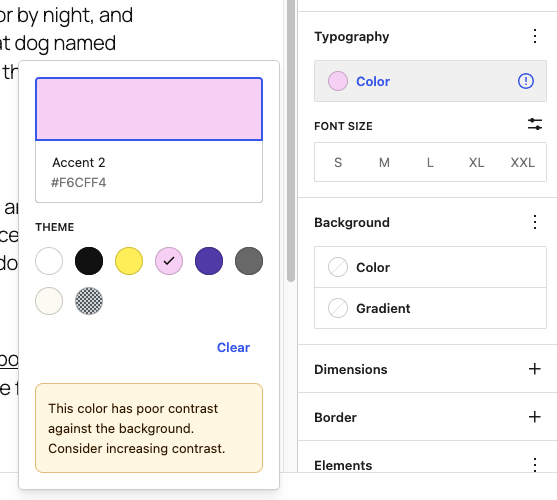
Find more about the typography settings in the block editor in the Typography Settings overview in the documentation on WordPress.org.
Resources
WCAG Success Criteria for color contrast
- 1.4.3 Contrast Minimum(Level AA).
- 1.4.6 Contrast (Enhanced) (Level AAA).
- 1.4.11 Non-text Contrast (Level AA).
Related pages in this documentation
- Sufficient color contrast of text and UI controls in the Theme guidelines for the WordPress accessibility-ready program.
- Placeholders in form fields in Frontend code, Web forms, Input and label.
Other resources
- Assistive Technology Experiment: High Contrast by WebAIM.
- Color Contrast And Why You Should Rethink It by Cathy O’ Connor on Smashing Magazine.
- Sim Daltonism, an open source color-blindness simulator for macOS and iOS.
- Colorblind Web Page Filter, a color-blindness emulating filter for a web page, by TopTal.
- Accessible color palette generator, a tool to generate accessible color palettes by Venngage.