Quick wins to improve the accessibility of your website
What to do first when you want to make your site more accessible? Start with the low-hanging fruit.
Like:
- Sufficient color contrast of text against its background.
- Alternative text with images in the content.
- Change all the “click here” link texts into meaningful text.
Seven quick accessibility wins
There is a lot you can do to improve a website without digging into code. Simple improvements that will dramatically improve the accessibility of your website.
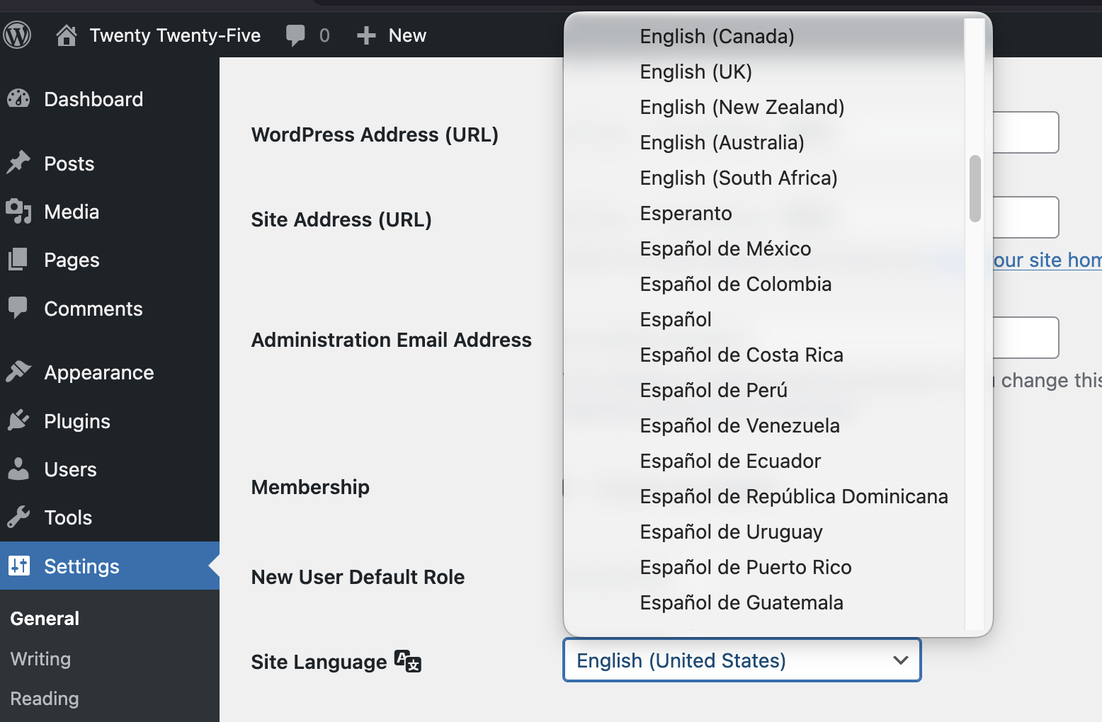
1: Set the correct site language
Check if the site language is set correctly. The correct site language setting helps tell screen readers how to pronounce the text.
In the WordPress Admin. go to: Settings > General and look for the dropdown Site Language. Select the language of the website.
If the language is spoken in multiple countries, select the language variation for the country. For example English (United Stated) for US English, and English (UK) if the site is written in British English.
2: Write descriptive, unique page titles
Write a descriptive, unique page title for every page. Make sure the page title describes what the page is about.
For WordPress, add the page title in the field “Add Title” when you create a new page or post. In most cases, this will also be the main heading (H1) of the page.
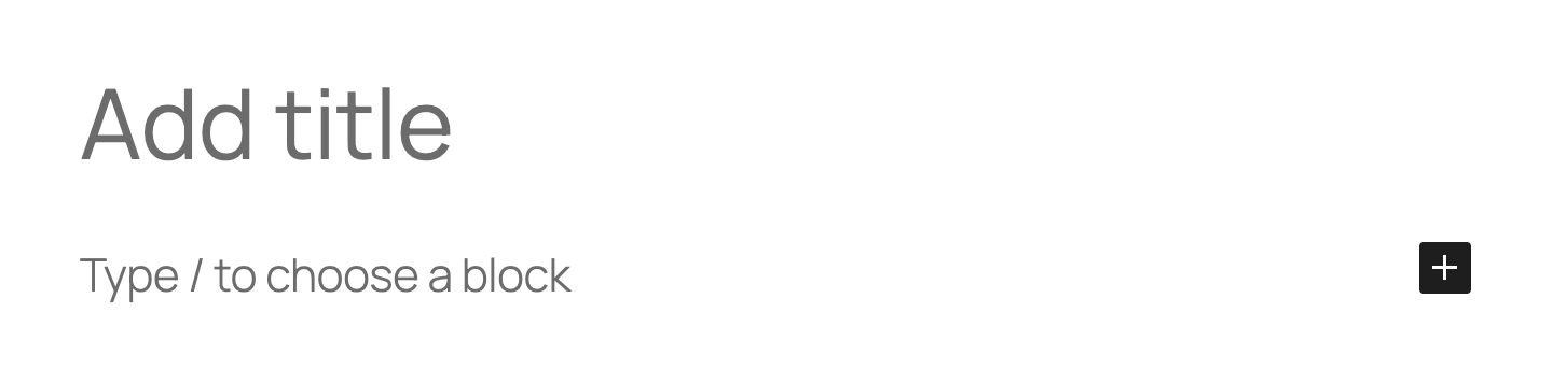
The page title is the first text that is announced by a screen reader after a page is loaded and is also shown in the tab of the browser.
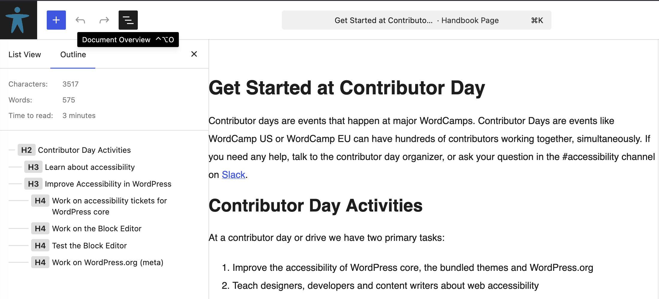
3: Use headings in a structured way
Structure content with proper heading levels (H1, H2, H3) in logical order. One H1 that tells what the page is about, the rest of the headings structure the content. Do not use headings to style text (for example to make text stand out visually, use headings to describe the text that follows after.
In WordPress, you can check the heading structure in the “Outline” tab. The outline tab is visible after clicking the button “Document Overview” in the top bar of the editor.
More on headings in:
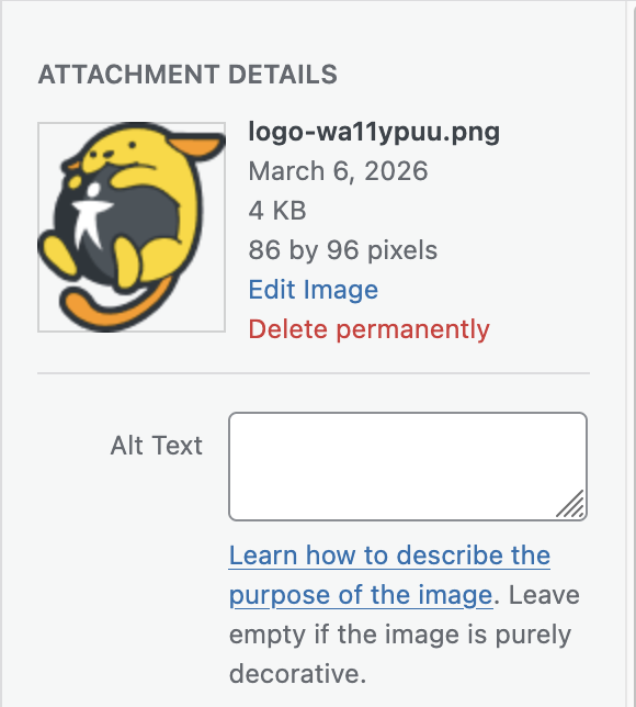
4: Add alternative text to images
Add descriptive alternative text to all meaningful images. Screen readers will announce that alternative text, so visitors that can not see the image will also know what it shows and won’t miss information.
In WordPress, you can add alternative text in the attachment details of an image.
More on alternative texts for images in: Alternative text for images.
5: Write meaningful link texts
Avoid using meaningless link texts like “here”, “click here”, “read more” or “download”. Screen reader users can call a list of links to quickly navigate a website. When a link reads as “Click here” they have no clue where the link will take them.
Instead of “Click here to read more about accessibility legislation”,
write “Read more about accessibility legislation”.
Another advantage is that sighted users don’t have to read the whole sentence to know what the link is about.
More about meaningful link texts in: Write meaningful link text.
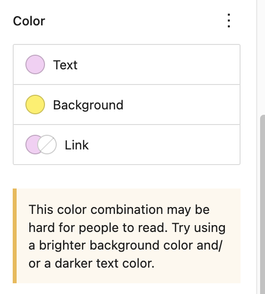
6: Check for sufficient color contrast for text
Check that text has sufficient color contrast against its background. People should be able to read your content with ease. Not everyone has perfect eyesight.
In WordPress, when you set a color and or background color in the editor, the software checks if the contrast meets accessibility guidelines.
More about how to calculate and test the color contrast: Color contrast of text against its background.
7: Add captions to videos
Add captions to all videos with spoken text (or lyrics, for songs). That way people who are deaf or hard of hearing don’t miss out on information.
Fun fact: Most users who turn on captioning or subtitles while watching a video or TV are not deaf. For example, people who are not native speakers of the language in the video and need supporting text; people who are in a noisy environment; or who don’t want to wake their partner in bed. Source: Survey: Why America is obsessed with subtitles.
Quick check you can do right now
Run your site through a free tool like the WAVE browser extension and check for accessibility errors.
More on test tools in: Test for accessibility.
Be better than 96% of the web
The most made errors reported in the yearly report WebAIM Million are:
- Low color contrast for text
- Missing alternative text on images
- Missing labels in forms
- Empty links
- Empty buttons
- Missing language in the
<html>element
96% Of all errors detected fall into these six categories. So: if these errors are all sorted, you are already better than 96% of the rest of the web.